|
|
|
|
|
Obesity is a key indicator of population health because it significantly increases the risk for many diseases, lowers life-expectancy, and can have an adverse effect on overall quality of life. More than one-third of adults in the United States are obese, making obesity a high priority public health issue.
Obesity can be caused by a range of factors including genetics, socio-economic conditions, and behavioral factors such as diet and exercise. This map series focuses on factors in the built and natural environment that can affect behavioral choices linked to obesity. It includes maps of (a) average body mass index (BMI) rates -- a weight-to-height ratio that is commonly used to measure obesity, (b) a composite map showing the connection between factors that promote healthy eating and active living with BMI rates, (c) a map comparing neighborhood walkability with BMI rates, and (d) maps showing how BMI patterns compare with demographic patterns related to race and income.

Note: Body Mass Index (BMI) data were not available for Clark County, so the analysis of this map series will only focus on the portions of the region located in Oregon.
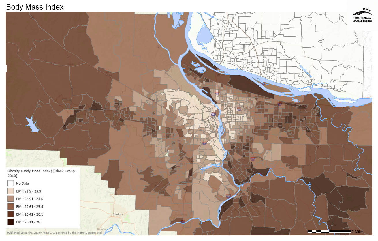
The Obesity (Body Mass Index) map shows a striking pattern, with the lowest BMI rates clustered in the region’s central core and getting successively higher moving out from the core towards the periphery. The census tracts with the lowest BMI rates are primarily located in neighborhoods on Portland’s east and west sides close to downtown, parts of Lake Oswego and adjacent unincorporated areas, and in several unincorporated neighborhoods located immediately west of Portland and north of US-26 in Washington County.
The Body Mass Index in Relationship to Healthy Eating Active Living Composite (HEAL) map suggests a strong relationship between HEAL factors -- such as access to transit, food, parks, recreation, and walkable neighborhoods -- and the ability to maintain a healthy weight. (For more information on the HEAL composite map, see the Healthy Eating Active Living map series.) The two maps are in many ways like two sides of the same coin; many of the areas with the highest HEAL scores have low BMIs while many of the areas with the highest BMIs have low HEAL scores.
There are some interesting exceptions to this pattern. Some neighborhoods toward the center of the region, such as a series of neighborhoods in Portland and Washington County to the northwest of Portland’s downtown, have relatively low HEAL scores but also have low BMIs. Conversely, there are hotspots in the region with relatively high HEAL scores but which have relatively high BMIs. Examples of these hotspots are located in Hillsboro and Beaverton.
The Body Mass Index in Relationship to Sidewalk Density map shows the same general pattern as the HEAL and BMI map, but with some interesting differences. The city of Portland has the highest sidewalk densities in the region. These high densities coincide with areas of low BMI in Portland’s inner east side and west side neighborhoods. But BMIs are higher in Portland’s north, northeast, and outer east side neighborhoods, even though sidewalk densities are also high in these neighborhoods. This pattern suggests that while factors in the built environment play a role in obesity rates, they are not the only determining factors. The Portland neighborhoods with the highest BMIs also tend to have lower incomes and higher rates of populations of color. Similarly, other areas of the region such as parts of Gresham, Forest Grove, and Cornelius that have relatively high sidewalk densities along with high BMIs also tend to have above average rates of poverty and populations of color. The next two maps allow us to explore the potential relationship between BMI, race, and income more directly.
The Body Mass Index in Relationship to Populations of Color map suggests a potential connection between race and BMI rates. Across the region, there are few areas with low BMI rates that have high densities of populations of color. Conversely, many areas with higher BMI rates tend to also have high densities of populations of color. For example, as noted in the previous section, the areas of north, northeast, and outer east Portland that have high sidewalk densities and higher BMIs tend to also have higher densities of populations of color than the areas of Portland with high sidewalk densities and low BMIs.
The map of Body Mass Index in Relationship to Percent Students Eligible for Free or Reduced Price Lunch offers further insights into the potential correlations between BMI and demographic factors. The percentage of students eligible for free and reduced price lunch is often used as a proxy for poverty. Mapping this indicator with BMI is useful because child obesity is a significant public health issue and because the way the school data are mapped makes it easy to see the visual patterns on the map. The map shows that the region’s low poverty schools (represented by the smallest pink dots on the map) tend to be located in areas with low BMIs. This relationship is the clearest in the core of the region, particularly to the west of the Willamette River. On the flip side, across the region, many of the highest poverty schools (represented by the biggest pink dots) are located in areas with high BMI rates.
There are some exceptions to this pattern on Portland’s east side, where some schools which have moderate rates of poverty are located in low BMI areas. Similarly, there are some low poverty schools located farther from Portland in areas of Clackamas County and Washington County that are in areas with higher BMIs. These exceptions suggest that BMI rates are the result of both demographic factors and factors in the built environment.
The maps in this series are thought-provoking and generate many potential questions worthy of further investigation. Given the significant role that obesity plays in the population’s health, the apparent correlation between demographic factors and BMI points to a significant health equity challenge that our region will need to address. At the same time, the relationships demonstrated in the maps between BMI rates and factors in the built environment indicate that targeted investments in resources like parks, transit, and walkable neighborhoods could begin to address these disparities.
This map is based on data derived from Oregon driver’s license information in Oregon Department of Motor Vehicles (DMV) records. The underlying height and weight data are self-reported, which is likely to skew the overall BMI rate downward (reflecting the tendency for people to under report their weight in driver’s license applications). Research indicates that the rate of under-reporting of weight in DMV records is relatively consistent, so the dataset is still useful for describing patterns. It is best used for comparative purposes rather than as a direct indicator of obesity levels at any given location.
Data Source: Oregon Department of Motor Vehicles data (2003-2010) processed by Oregon Environmental Public Health Tracking System
This map combines the Healthy Eating Active Living Composite density map with the Body Mass Index map.
Data Source: Oregon Department of Motor Vehicles data (2003-2010) processed by Oregon Environmental Public Health Tracking System, Metro RLIS (2012), Clark County GIS (2012), U.S. Department of Agriculture (2012); Portland Farmers' Market (2012); Oregon Environmental Council (2012); ESRI Business Analyst (2010)
This map combines the Walkability - Sidewalk Density map with the Body Mass Index map
Data Source: Oregon Department of Motor Vehicles data (2003-2010) processed by Oregon Environmental Public Health Tracking System, Metro RLIS (2012)
This map combines the Populations of Color (Density by Acre) map with the Body Mass Index map.
Data Source: Oregon Department of Motor Vehicles data (2003-2010) processed by Oregon Environmental Public Health Tracking System, U.S. Census (2010)
This map combines the Percent Students Eligible for Free or Reduced Price Lunch point layer with the Body Mass Index map.
Data Source: Oregon Department of Motor Vehicles data (2003-2010) processed by Oregon Environmental Public Health Tracking System, Oregon Department of Education & Washington Office of the Superintendent of Public Instruction (2011-2012)